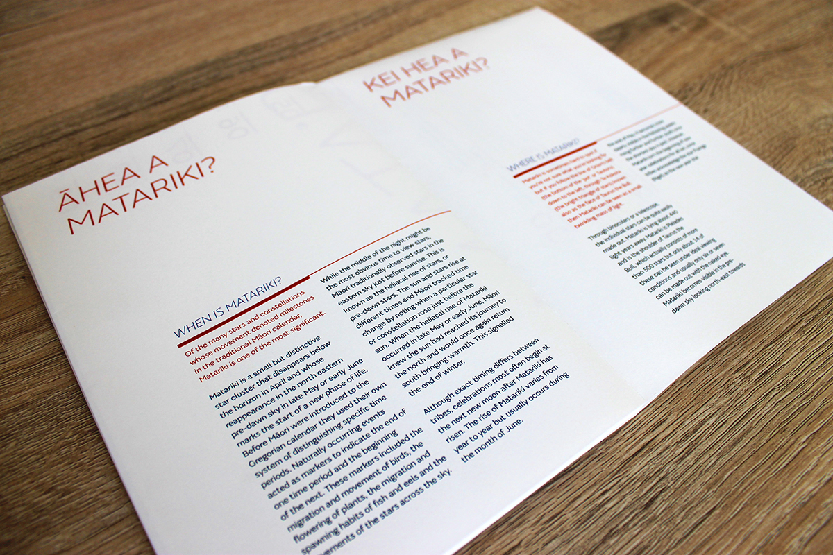


For this project, I wanted the Matariki Booklet and Calendar to look minimalistic yet professional. I chose portrait as my orientation as I wanted to vertically step the days of the months to create a sense of movement.
The colours I chose were a rich red, a mid-tone blue and a dark, almost black-blue. I printed on a cream stock akin to the colour of the moonlight as I wanted to use conventional colours, but not in a conventional way - this is why I chose cream as my background - moonlight, rather than blue as the night sky. I also used italics as a tier of hierarchy and also put the Matariki title on a diagonal to create movement within my composition to further contribute to the vertical movement of the days of the months.


